Pop Life Entertainment
Art direction · Brand identity
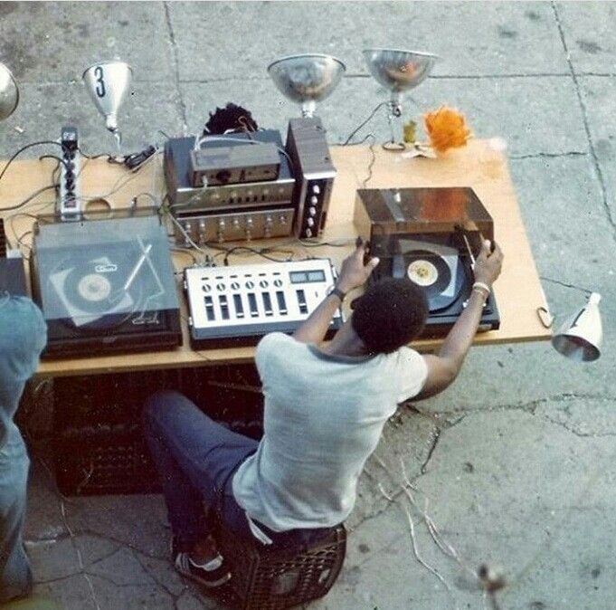
Founded by music executive Kirk Burrowes, Pop Life Entertainment exists at the intersection of music, media, and culture. The challenge was to create an identity that honored its legacy while positioning the brand for a new generation of creators.

Brand vision
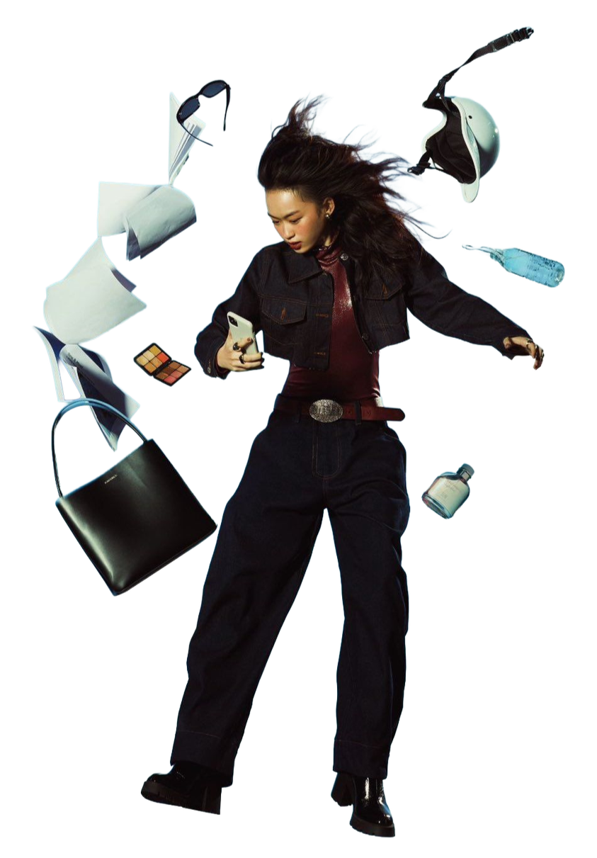
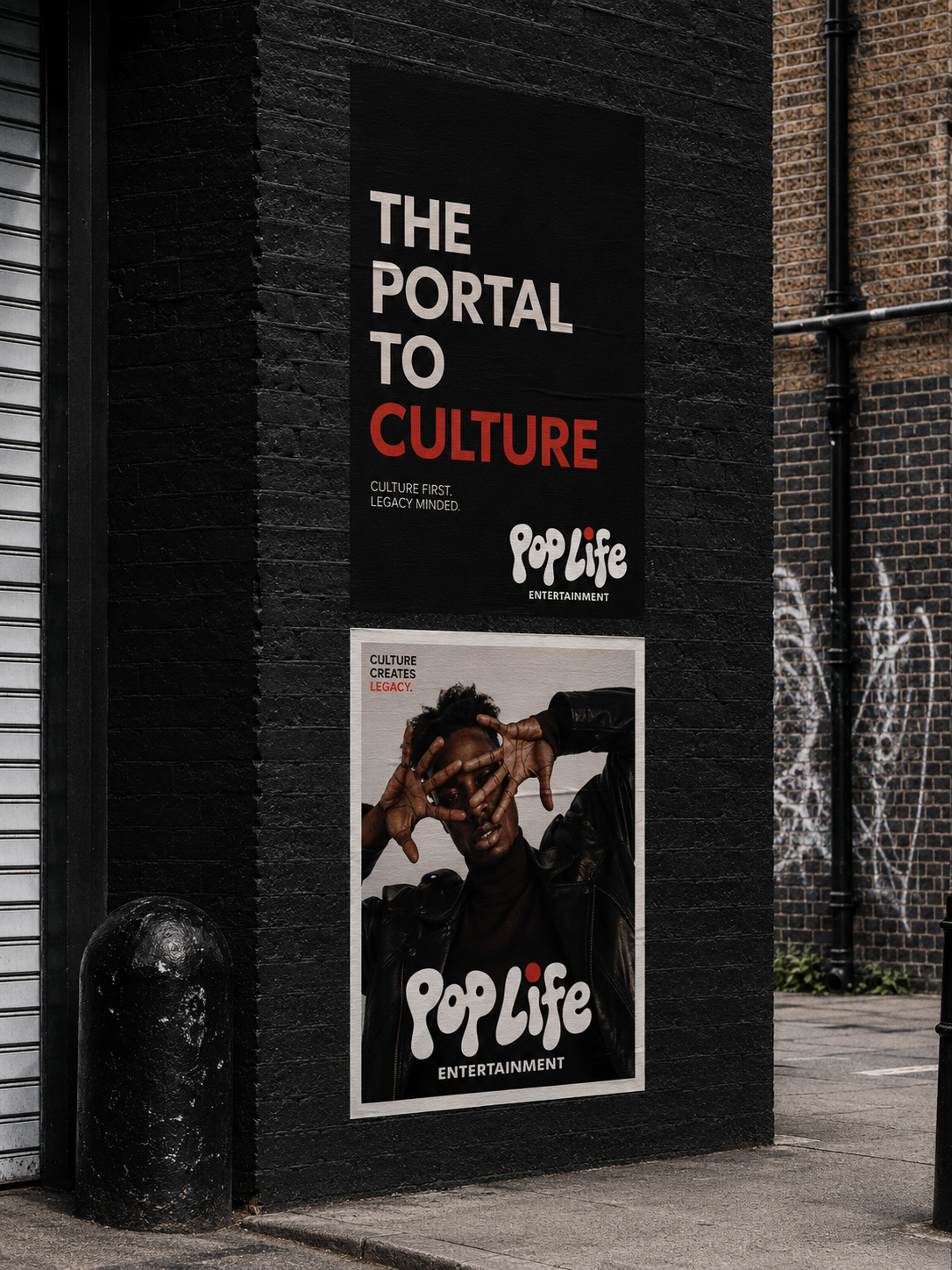
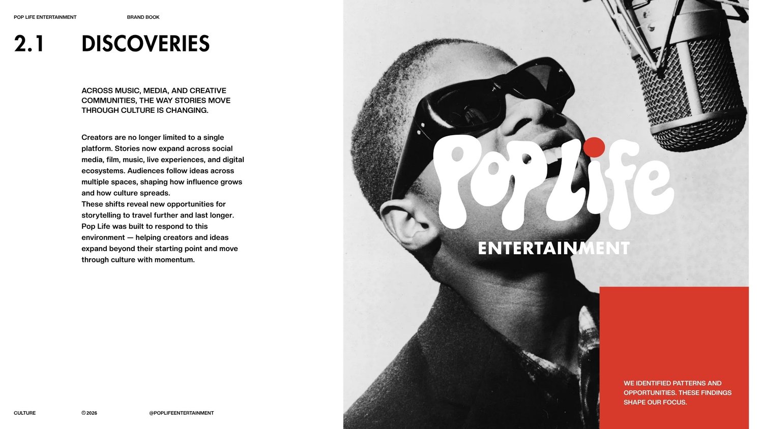
Pop Life Entertainment exists behind the work—not just as a platform for creators, but as the force shaping ideas from concept to culture. The identity pairs bold typography with thoughtful composition, creating a visual language that feels confident, expressive, and built for longevity.
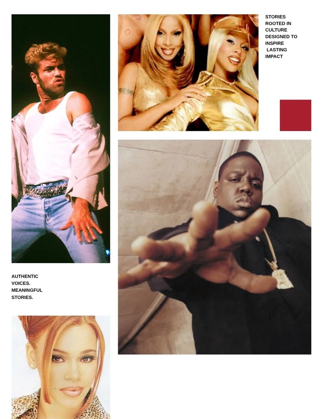
Brand manifesto


The visual system
One identity. Room to play.
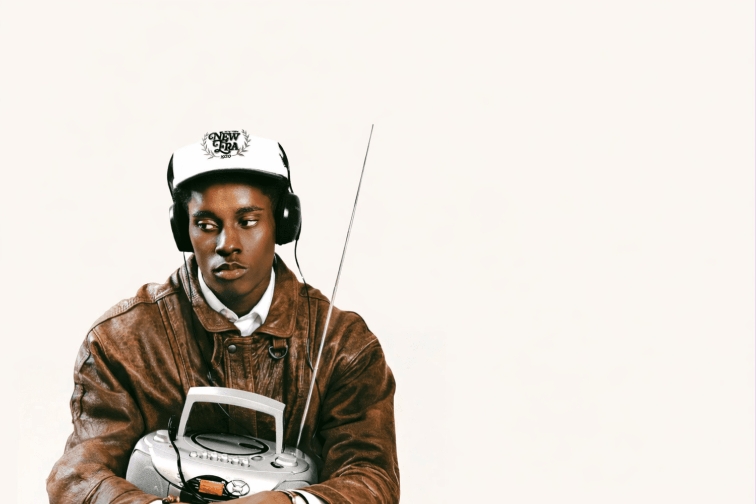
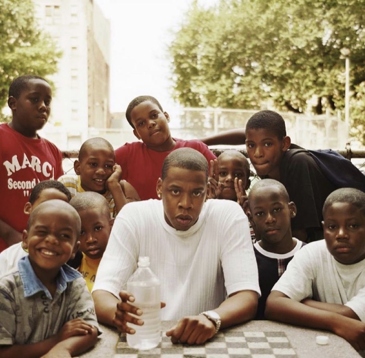
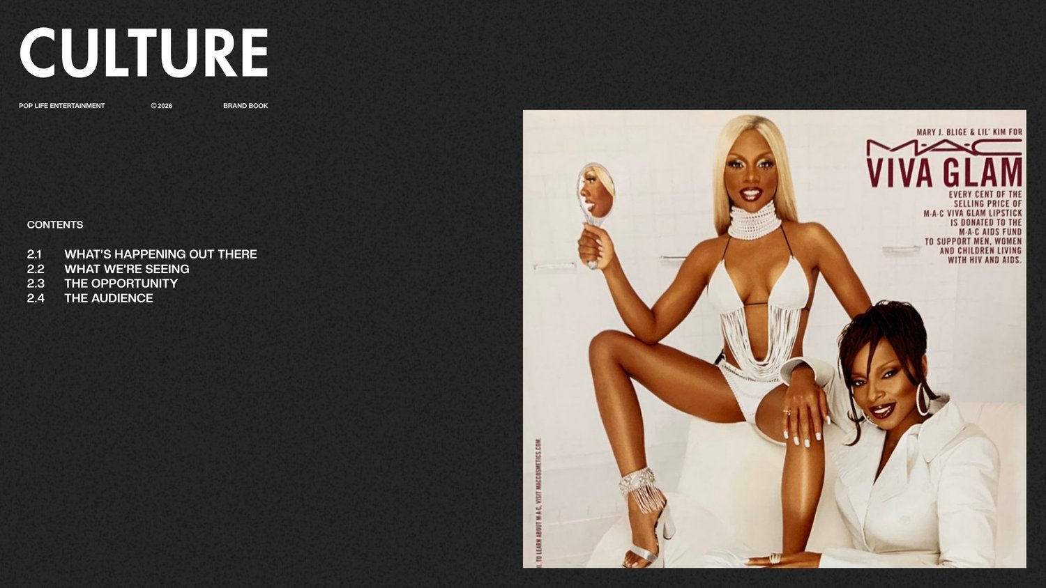
The logo, color, type, and imagery work together across social templates, environments, and the brand book.
A deliberate pop.
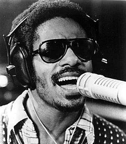
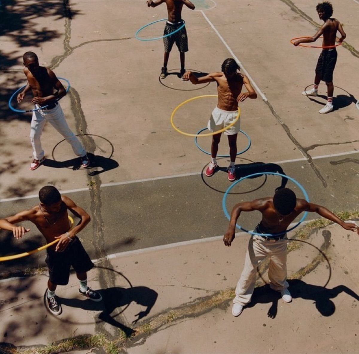
Red acts as an accent. Blue lives in the imagery, rather than becoming a primary brand fill.
Space to breathe.
Expansive white space balances expressive imagery. Sky occupies roughly a third of the frame to create rhythm.
Connected expressions.
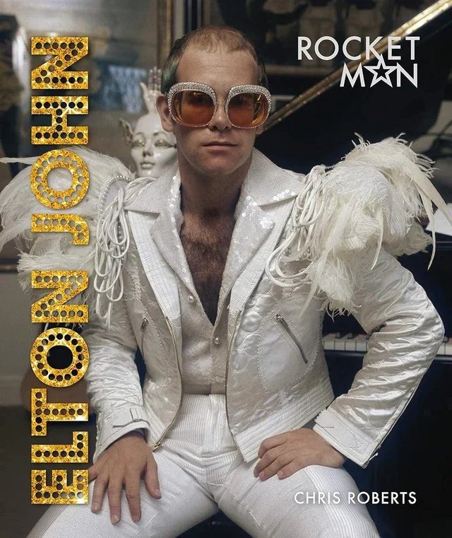
Bold typography, icons, and backgrounds carry the same visual language into different formats.
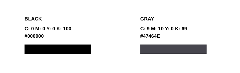
Color palette
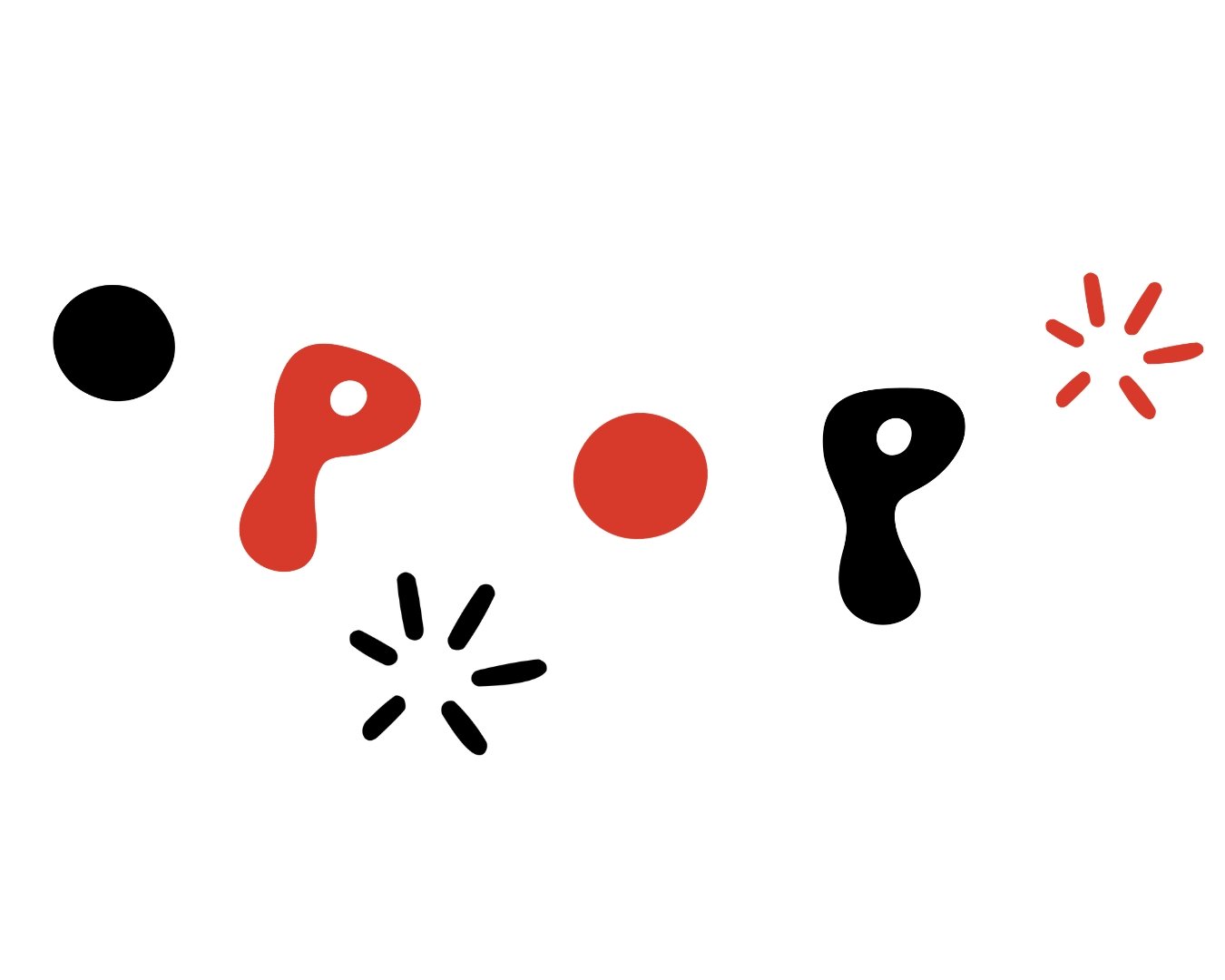
Pop icons
Pop background



Futura Bold
Headlines · Tracking 30
Creato Display
Paragraphs · Tracking 20
Pop typography
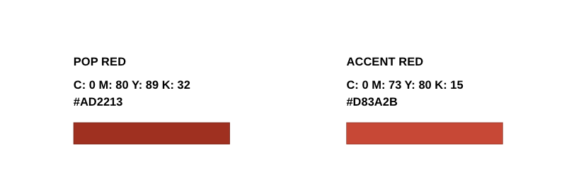
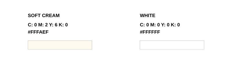
Pop Life Entertainment’s color system relies on controlled contrast—vivid pops of red, with blue used only within imagery and never as a primary brand fill.
The palette is grounded by expansive white space. Color functions as an accent, not a fill, allowing imagery to remain dynamic yet composed. Sky elements act as a balancing device, occupying roughly one-third of the frame to create visual rhythm and breathing room.
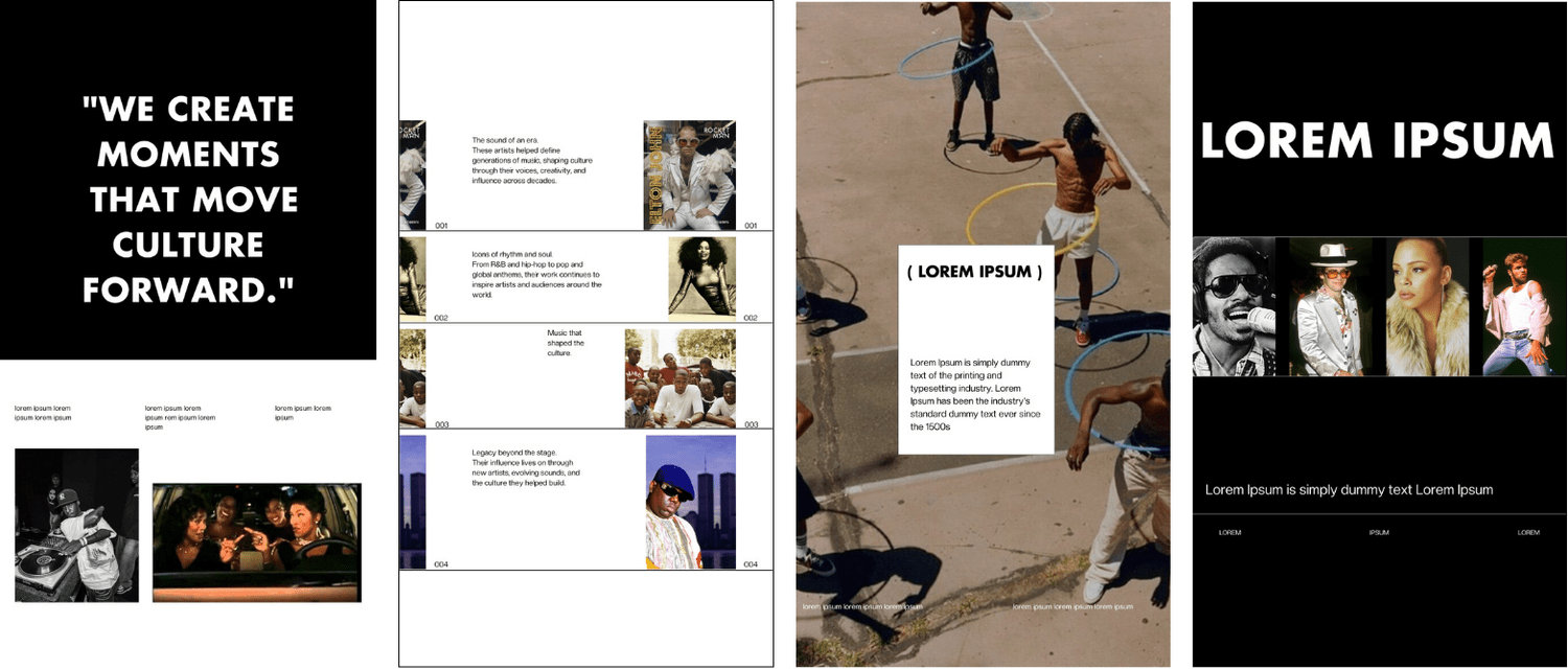
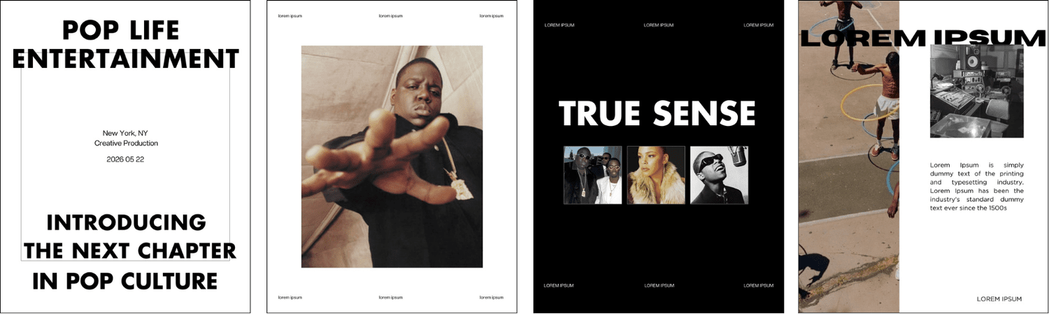
Social media templates
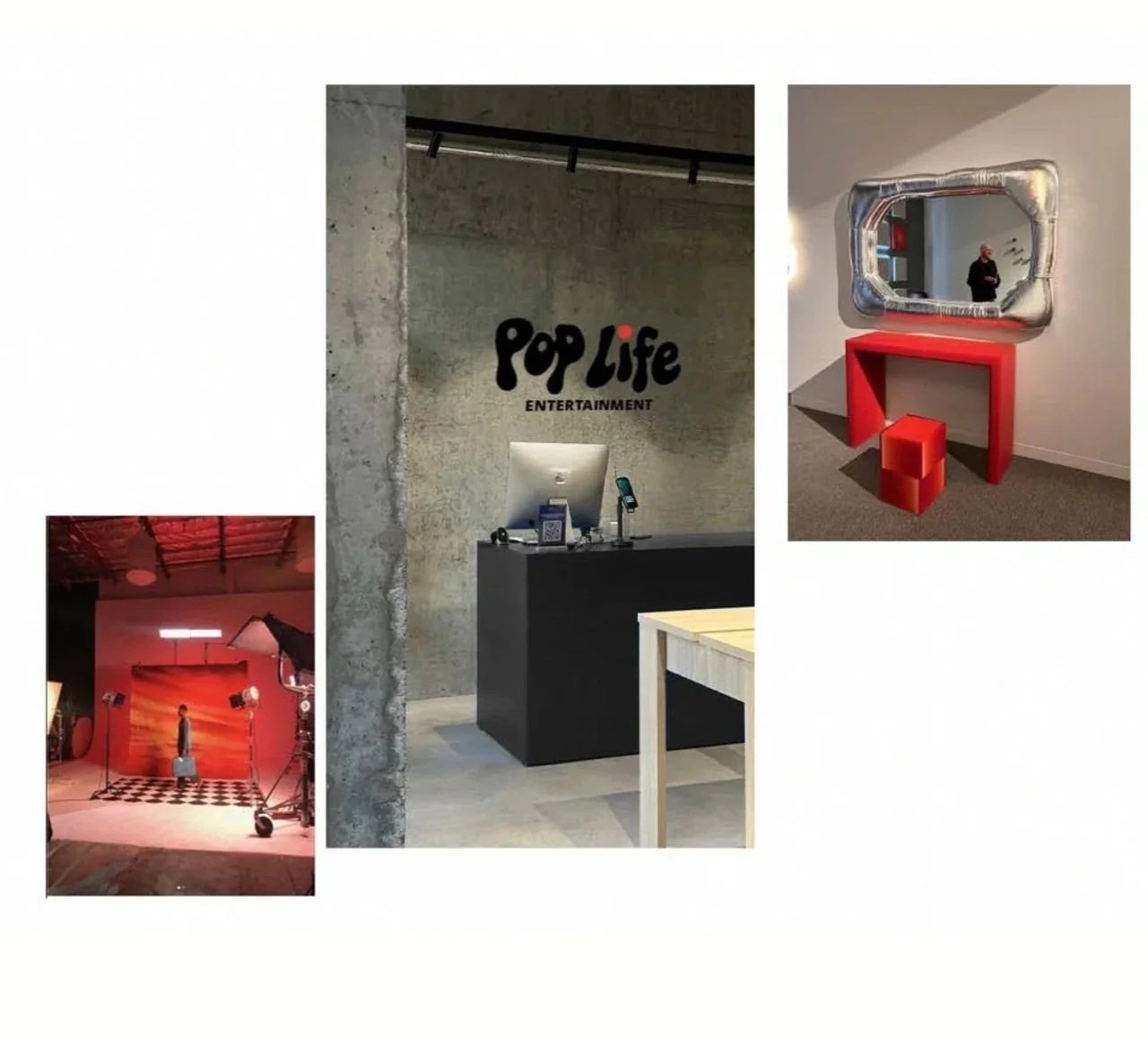
Production studio
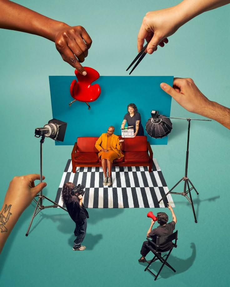
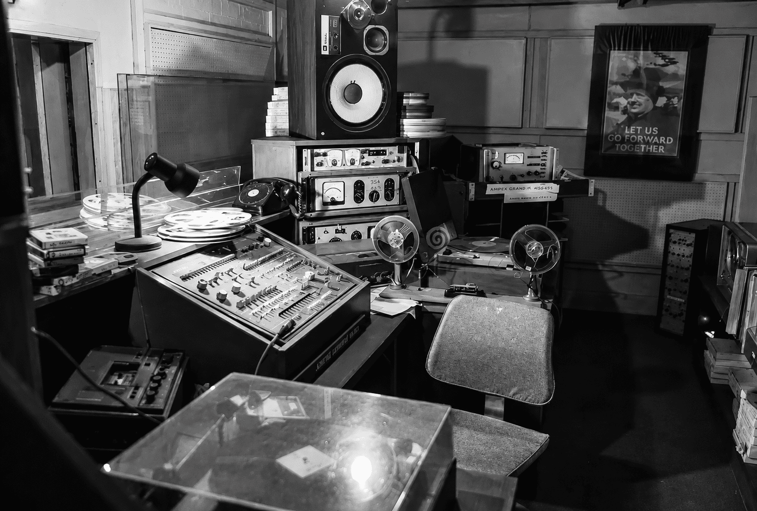
Bold color and clean composition bring the Pop Life identity into studios, sets and creative workspaces.
POP LIFE ENTERTAINMENT MORGENTHAL FREDERICS ROBERT MARC NYC ANNEMARIE BÖRLIND GEORGETOWN OPTICIAN MIXTO CREATIVE HOUSE ROAR AFRICA